
Amazon Lens: Unified CX
Designing Visual Search Experience to be Unified, Discoverable, and Accessible

Client: Amazon
Role: UX Designer
Team/Product: Visual Search, Amazon Lens
Skills: UX, AI, Systems Thinking, Cross-Platform Design, Accessibility
Platform: iOS, Android
Year: 2024 – 2025
Intro
Amazon Lens is an AI-powered visual search tool in the Amazon app, letting users find products via camera, images, or barcodes. As part of the Visual Search team, I led UX efforts to improve discoverability, usability, and conversion.
I designed the “Lens Unified” initiative (aka “Super Mode”) to resolve a fragmented UX and combine three entry points into one clear, accessible interface, simplifying navigation and boosting engagement.
Through the “Lens Awareness” initiative, I revamped the icon, onboarding, and permissions flows to reduce friction and increase adoption. These changes lowered entry barriers and built user confidence.
This case shows how good UX design makes AI tools easier to use and helps shoppers understand and use Amazon Lens better.
Problem
While Lens offered powerful functionality, it suffered from low adoption and usability issues:
Key Pain Points:
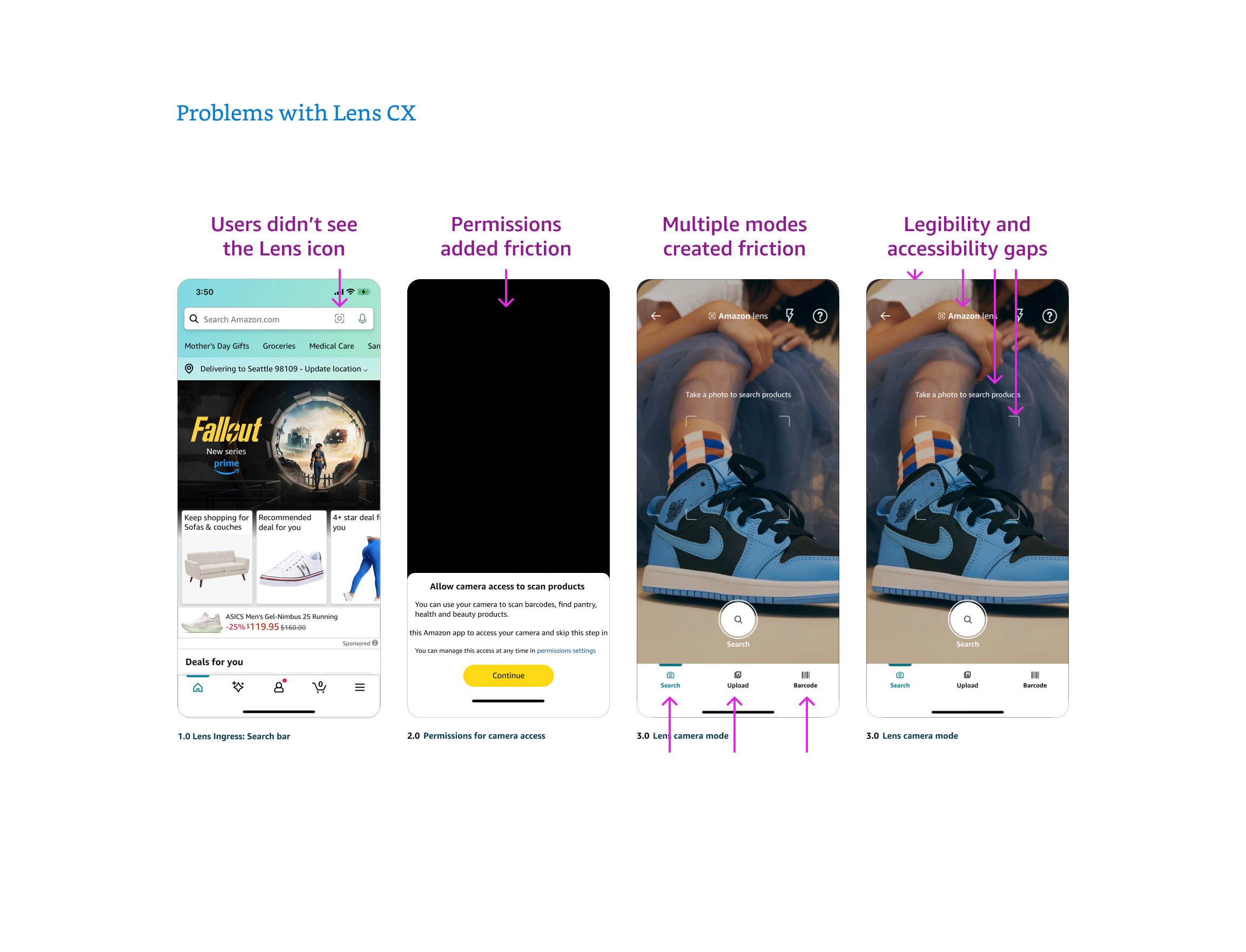
Fewer than 15% of app users noticed the Lens icon, and it was misunderstood, leading to high drop-off at permission prompts.
Multiple modes (camera, upload, barcode) confused users and created inconsistent experiences
Permission prompts caused drop-off due to poor timing and lack of context
Accessibility gaps reduced usability for large segments of customers
What I did
As a UX Designer for Amazon Unified, I led the comprehensive redesign of the Lens visual search tool, retooling the Lens icon to boost awareness, and introduced a new Lens Landing page to assist in onboarding, and owning all projects from concept to implementation.
-
I designed screens and flows to update the three modes, most significantly, I proposed the introduction of a new page aimed at improving adoption via an educational landing page, securing approval from stakeholders on adjacent teams. Always including detailed annotations and a comprehensive historical background, to abate differences of opinion and resolve to a conclusion. Throughout, I prioritized accessibility and clarity by ensuring higher contrast, proper spacing, and scalable layouts compatible with both orientations on mobile platforms. Additionally, I implemented collision-prevention logic to maintain seamless user interactions and prevent overlapping elements.
consistent text and image placement across screen sizes.
-
I presented to cross-functional and adjacent teams to deliver key design updates on tight timelines, aligning efforts ahead of critical release dates. I managed communication and decision-making across design, engineering, and product to keep the project on track and within scope.
-
I designed and transitioned the Lens icon away from an abstract symbol with low comprehension and engagement to a camera icon with an AI sparkle as a the flash that lead to near 100 recognition and high engagement. The new icon had to win A/B tests, align with broader design guidelines, and gain C-level support and approval, which it did, and has lead to improved clarity and alignment.
-
I validated design choices through testing, selecting the most effective upload imagery and generalizing components to serve broader user needs. I analyzed user feedback to refine visuals and interactions to ensure they resonated across diverse audiences.
-
I delivered pixel-perfect mockups and interaction specs detailing mode-switch behavior, entry/exit flows, loading edge cases, and permission logic, for both portrait and landscape, and both iOS and Android. In addition, I documented responsive scaling logic, accessibility requirements, and image optimization guidelines to ensure consistency across devices and performance within file size constraints.
Lens Unified CX
I redesigned the core Lens experience to merge camera, image upload, and barcode scan into a single, streamlined interface. This eliminated tab switching, reduced decision friction, and created a scalable pattern for future capabilities.
I mapped entry and exit flows, designed visual hierarchies for alternate actions (upload, scan), and optimized edge-case behavior like permission denial and scan timeouts. The result was a more intuitive, mobile-first experience that aligned with user mental models.
2. Lens Awareness
Users didn’t understand what the Lens icon did — or notice it at all. I redesigned the icon with a subtle sparkle motif, signaling intelligence and discoverability without changing the core symbol.
The updated icon was tested, adopted across surfaces, and sparked a broader brand refresh, ultimately becoming the official mark for Amazon Lens. I also advocated for persistent icon placement during search bar interaction, improving visibility by ~50%.
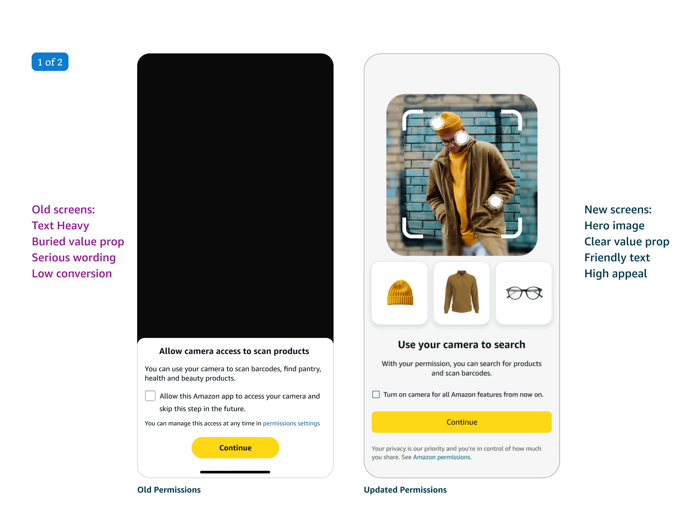
3. Permissions Optimization
Original permissions logic asked for camera access before users understood what the tool was, leading to bounce and churn. I introduced a new landing page to onboard and reordered the flow so users first saw value, then were prompted for access — increasing trust and completion.
I rewrote UX copy, clarified transitions, and coordinated with engineers to time the permission prompt after contextual introduction. Combined with the landing page, this cut drop-off significantly and made the feature feel less intrusive.
4. Landing Page
The original setup asked for camera access before users knew what the tool did, causing many to leave. I made a new landing page that showed value first, then asked for permission, building trust and improving completion rates. To boost first-time use, I designed a Lens landing page with a simple, impactful carousel showing real examples like scanning fashion, home items, and replacement parts. The page was fully responsive, localized, and accessible. This new flow raised awareness, cut drop-offs, and encouraged users to explore more features.
5. Specification & Engineering Handoff
I delivered platform-specific mockups and interaction specs for iOS and Android, including mode-switch logic, UI states, camera error handling, and accessibility behaviors. My Figma files were cleanly structured, fully annotated, and pixel-perfect.
In addition, I documented scaling behavior, optimized image assets for performance, and created grouped accessibility specs by screen section. My handoff ensured engineers had everything needed to build accurately and efficiently, across devices.

Results
Though still in rollout, internal metrics and early research indicate a strong impact, projected numbers are:
🧭 Feature Awareness: +35% increase in first-time Lens usage
⏱️ Reduced Drop-Off: 50% fewer users abandon after granting camera access
🔍 Search Conversion: Projected 25% rise in product views from visual searches
♿ Accessibility Compliance: 100% WCAG AA alignment achieved
⌛ Session Time: +20% increase in time spent using Lens
🔁 Cross-Mode Usage: 35% more users tried varied search methods per session.
🛠️ Operational Efficiency: Cut design and engineering work by unifying UI.
Together, these outcomes point to a visual search feature that's better integrated, more discoverable, and now primed for cross-category growth — all while being inclusive, intuitive, and performant at scale.